
A 12×12 living room offers exactly 144 square feet of usable space, enough to create a comfortable, functional gathering area if planned carefully. The square footprint eliminates awkward narrow zones but introduces its own challenge: avoiding a boxy, static feel. Most homeowners struggle with furniture scale, traffic flow, and making the room feel larger than it is. The key lies in intentional furniture placement, understanding sight lines, and using the room’s geometry to create zones without visual clutter. With the right layout strategy, a 12×12 space can comfortably seat guests, accommodate media, and still feel open.
Table of Contents
ToggleKey Takeaways
- A 12×12 living room layout works best when you float furniture 12–18 inches from walls and maintain 30–36 inch traffic pathways, creating depth instead of the hollow, rigid feel of wall-to-wall arrangements.
- Scale is critical—stick to sofas under 96 inches and other pieces under 72 inches to avoid overwhelming a 144 square foot space while preserving comfortable conversation distances of 8 feet or less.
- The five proven 12×12 living room layout configurations (conversation-focused, media-centered, multi-functional, and others) each serve different priorities, so choose based on your household’s primary activities and gathering needs.
- Vertical design elements like floor-to-ceiling shelves, wall-mounted lighting, and tall lamps counteract the enclosed feeling of square rooms and maximize the room’s 1,152 cubic feet of volume.
- Strategic mirrors opposite windows, furniture with exposed legs, and high-mounted lighting multiply the sense of openness without structural changes, making a compact 12×12 feel significantly larger.
Understanding the Potential of a 12×12 Living Room Space
A 12×12 room is classified as a small to medium living space in residential design. For context, the average American living room measures around 330 square feet, making a 12×12 roughly 44% of that size. But square rooms have advantages: equal wall lengths create balance, and there’s no single “short” wall that limits furniture options.
Spatial realities matter. With standard 8-foot ceilings, the room contains 1,152 cubic feet of volume. Assuming a 3-foot traffic path is maintained around primary seating, the usable furniture footprint shrinks to about 9×9 feet, 81 square feet. That’s the working zone for sofas, chairs, and tables.
Scale is everything. A standard three-seat sofa runs 84 to 96 inches long. In a 144-inch-wide room (12 feet), that leaves 48 to 60 inches on the remaining walls, tight, but manageable. Oversized sectionals (100+ inches per leg) will overwhelm the space and block pathways. Choosing furniture with a footprint under 72 inches per piece keeps proportions comfortable.
Vertical space becomes an asset in compact rooms. Floor-to-ceiling bookshelves, tall lamps, and wall-mounted storage draw the eye upward, counteracting the enclosed feeling. Paint color, while not a structural concern, affects perceived size, lighter tones reflect more light and can make walls feel farther apart.
One often-overlooked factor: door swing and window placement. A door requires a 32-inch clearance arc. Windows limit where tall furniture can go without blocking natural light. Measure and mark these on a floor plan before arranging furniture. It’s easier to solve layout problems on paper than by moving a sofa four times.
Essential Furniture Placement Strategies for Square Rooms
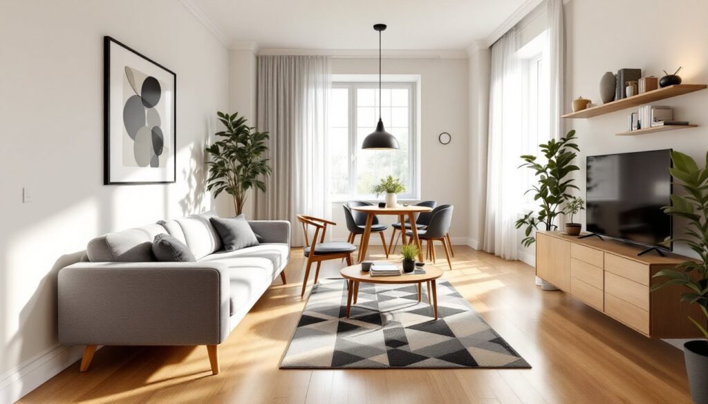
Square rooms tempt people to push furniture against all four walls, creating a hollow center. This maximizes open floor space but kills conversation flow and makes the room feel like a waiting area. Instead, pull seating 12 to 18 inches away from walls to create depth and layering.
Anchor with the largest piece first. In most living rooms, that’s the sofa. Position it opposite the room’s focal point, a fireplace, window with a view, or media console. Floating the sofa (placing it away from the wall) works in a 12×12 if there’s at least 30 inches of clearance behind it for walking. If space is tighter, the sofa can sit against one wall, but avoid centering it perfectly, offset placement breaks up symmetry and feels less rigid.
Create a conversation zone by arranging seating in a U-shape or L-shape, with all seats no more than 8 feet apart. Beyond that distance, conversation becomes strained. A sofa paired with two accent chairs across a coffee table forms a natural grouping. The coffee table should sit 14 to 18 inches from the sofa edge, close enough to reach a drink, far enough to avoid knee-banging.
Traffic paths need 30 to 36 inches of clearance. Identify the room’s entry and exit points and ensure a clear walkway that doesn’t force people to squeeze between furniture. In a 12×12, this usually means one main path along the perimeter and a secondary route through the center.
Corner zones are prime real estate. A corner shelving unit, tall plant, or reading chair with a floor lamp activates dead space without obstructing flow. Avoid placing bulky recliners or sectional ends in corners, they trap space and limit flexibility.
Consider sight lines from the entry. The first thing visible when walking into the room sets the tone. If it’s the back of a sofa or a cluttered wall, the space feels cramped. Aim to reveal the room’s focal point or an attractive vignette, art, a styled shelf, or a window.
5 Proven 12×12 Living Room Layout Configurations
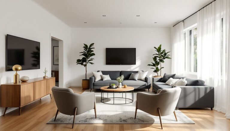
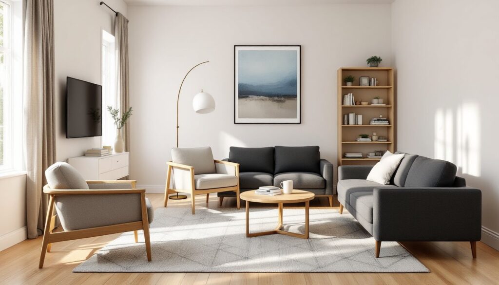
Conversation-Focused Layout
This setup prioritizes face-to-face seating and works well for families or frequent entertainers. Place a 72-inch sofa against one wall, flanked by two 28- to 32-inch-wide accent chairs positioned at slight angles to form a U-shape. A 36×36-inch square coffee table or 48-inch oval sits in the center, providing surface area without sharp corners that eat into walkways.
Leave the wall opposite the sofa open or use it for a low console table (30 inches tall or less) with lighting and decor. This keeps the room from feeling boxed in. Side tables between the sofa and chairs hold lamps and drinks. Total furniture footprint: roughly 9×10 feet, leaving a 2- to 3-foot perimeter for circulation.
Pros: Encourages interaction, flexible for different group sizes.
Cons: Limited media viewing setup unless a TV is wall-mounted above the console.
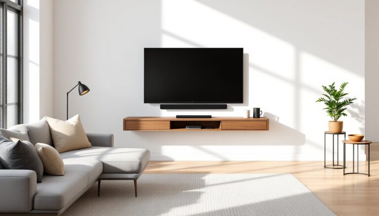
Media-Centered Layout
For TV-focused households, orient the sofa directly facing the screen, mounted on the wall or placed on a 60- to 65-inch media console. Ideal viewing distance for a 50- to 55-inch TV is 6.5 to 8 feet, which a 12×12 room easily accommodates.
Add a small sectional (70 to 80 inches in total length) or a loveseat paired with a chaise lounge to maximize seating without blocking sightlines. Keep the coffee table narrow, 20 to 24 inches deep, to preserve legroom. Use the adjacent wall for a bookshelf or storage cabinet to house media equipment and reduce clutter.
Pros: Optimized for viewing comfort, clean sightlines.
Cons: Conversation seating is secondary: less flexibility for gatherings.
Multi-Functional Layout
In homes where the living room doubles as a workspace, reading nook, or guest sleep area, zoning is critical. Divide the 12×12 into two functional areas using furniture arrangement or a 5×7 or 6×9 area rug to define the primary seating zone.
Place a compact 68-inch sofa or sleeper sofa along one wall. On the opposite side, position a writing desk (42 to 48 inches wide) or a pair of armchairs with a small side table for reading. A narrow console table (12 to 15 inches deep) behind the sofa can serve as a room divider without blocking light or views.
Storage is key in multi-use spaces. Cube organizers, storage ottomans, and wall-mounted shelves keep the room tidy and flexible. Avoid bulky pieces that lock the layout into one configuration.
Pros: Adaptable for multiple activities, good for small apartments or studios.
Cons: Requires discipline to avoid clutter: less cohesive aesthetic.
Space-Enhancing Design Tips for Compact Living Rooms
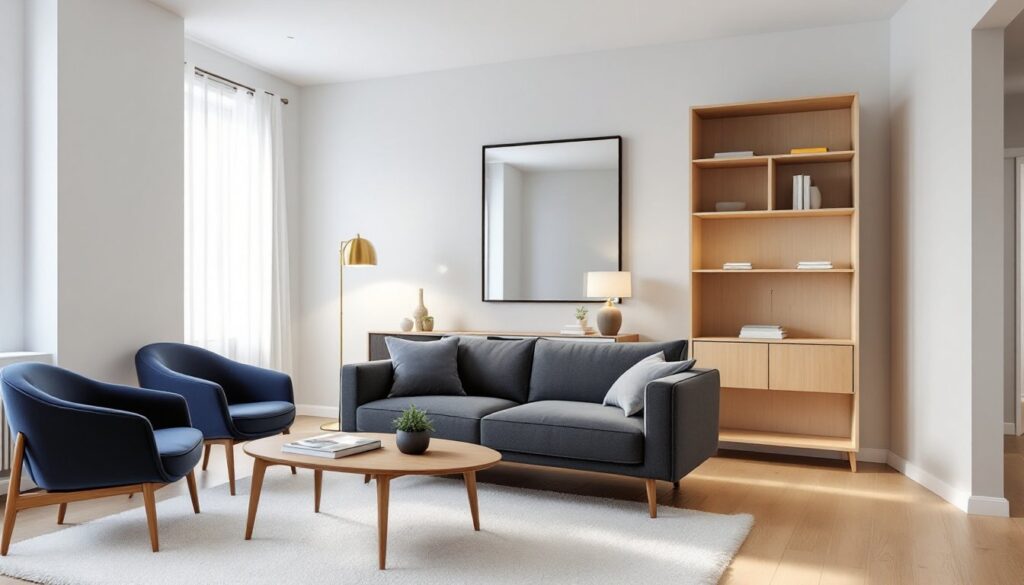
Use mirrors strategically. A 24×36-inch or larger mirror placed opposite a window reflects natural light and visually doubles the room’s depth. Avoid mirroring all four walls, it creates a disorienting funhouse effect.
Choose furniture with exposed legs. Sofas and chairs that sit on legs (rather than skirted bases that touch the floor) allow light to pass underneath, making pieces feel lighter and the room more open. Aim for 4- to 6-inch leg clearance.
Limit the color palette. Stick to two or three main colors for larger pieces. Too many competing tones fragment the space visually. Neutrals with one or two accent colors keep the eye moving smoothly.
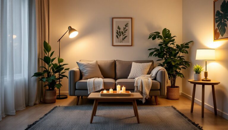
Mount lighting high. Wall sconces and pendant lights free up floor and table space while providing ambient and task lighting. A centrally located ceiling fixture should be supplemented with at least two additional light sources to eliminate dark corners.
Swap bulky window treatments for streamlined options. Roller shades, cellular shades, or simple linen panels take up less visual space than heavy drapes with valances. Mount curtain rods as close to the ceiling as possible and let panels hang to the floor, this elongates the wall.
Incorporate hidden storage. Storage ottomans, lift-top coffee tables, and benches with interior compartments reduce clutter without adding extra furniture pieces. Every item in a small room should serve at least two purposes.
Keep walkways clear. Even with thoughtful layout, a 12×12 room feels cramped if pathways are obstructed. Regularly assess whether each piece of furniture earns its footprint. If a chair sits unused for weeks, relocate or remove it.
Scale artwork appropriately. One large piece (30×40 inches or bigger) makes a stronger statement than a gallery wall of small frames, which can look busy. Hang art at eye level (57 to 60 inches from the floor to the center of the piece) to maintain proportion.
With disciplined planning and a focus on scale, traffic flow, and purposeful design, a 12×12 living room can feel both spacious and highly functional, proof that smart layout matters more than square footage.