
Choosing the right paint color for a living room isn’t just about personal taste, it affects how the space feels, how large it appears, and even how much natural light it reflects. A well-chosen color can make a cramped room feel open or transform a sterile box into a cozy gathering spot. With 2026’s trends favoring both warm, grounded neutrals and bold, expressive tones, homeowners have more flexibility than ever. This guide breaks down the best living room paint colors by style, room size, and function, with practical tips for making the choice stick long after the roller dries.
Table of Contents
ToggleKey Takeaways
- Light reflectance value (LRV) is critical when choosing the best colors to paint living room: colors above 50 LRV brighten spaces, while those below 50 create intimacy by absorbing light.
- Warm neutrals like greige and warm whites are versatile, timeless choices that pair well with most furniture styles, though cool tones like sage and soft blue work better in south-facing rooms or warm climates.
- Test paint samples at full scale (2×2 feet minimum) on multiple walls over several days under both natural and artificial light to avoid costly repaints, as colors shift dramatically based on lighting conditions.
- Room size and ceiling height should guide your choice: small rooms benefit from high-LRV colors (above 60) to feel larger, while large rooms can handle darker, saturated colors without feeling cramped.
- Bold statement colors like deep navy, terracotta, or emerald greens require commitment, quality primer, and layered lighting but deliver serious personality in spacious living rooms.
- Assess fixed elements first—flooring, fireplace, and trim—then match your paint color’s undertone and sheen (eggshell or satin for living rooms) to existing décor and light exposure direction.
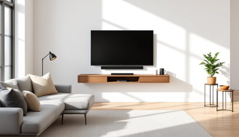
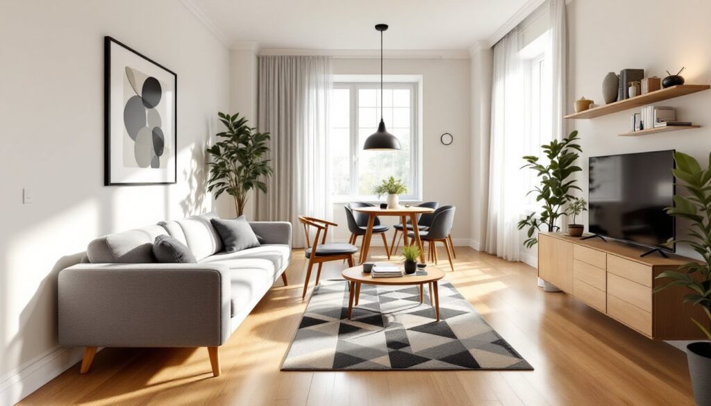
Why Living Room Color Matters More Than You Think
Paint is one of the cheapest ways to change a room’s entire personality, but it’s also one of the most permanent-feeling decisions a homeowner makes. Unlike throw pillows or artwork, wall color surrounds every piece of furniture and sets the baseline for lighting, mood, and perceived space.
Light reflectance value (LRV) is a key technical consideration. LRV measures how much light a paint color reflects on a scale from 0 (pure black) to 100 (pure white). Colors with an LRV above 50 brighten rooms and make them feel larger, while those below 50 absorb light and create intimacy. This matters especially in living rooms with limited windows or north-facing exposure.
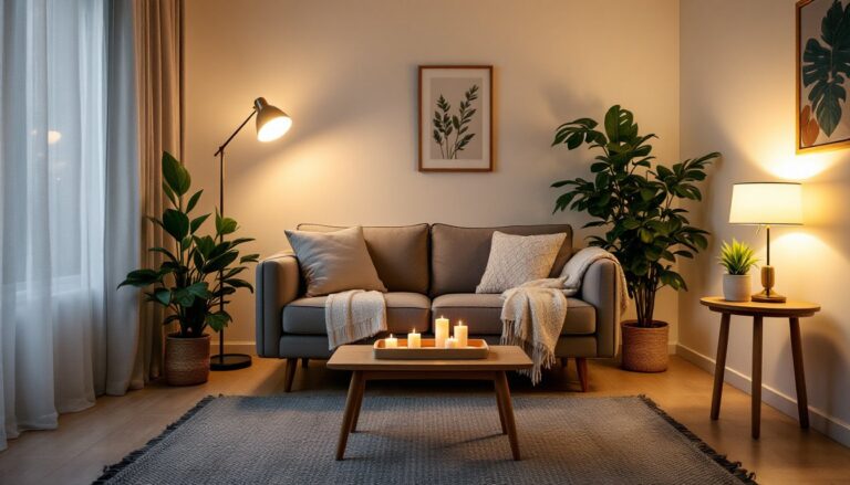
Color also influences perceived temperature. Warm hues (reds, oranges, yellows, warm grays) make spaces feel cozier but can visually shrink a room. Cool tones (blues, greens, cool grays) open up space and promote calm but may feel sterile without the right accents. Understanding these effects helps homeowners avoid costly repaints and buyer’s remorse six months in.
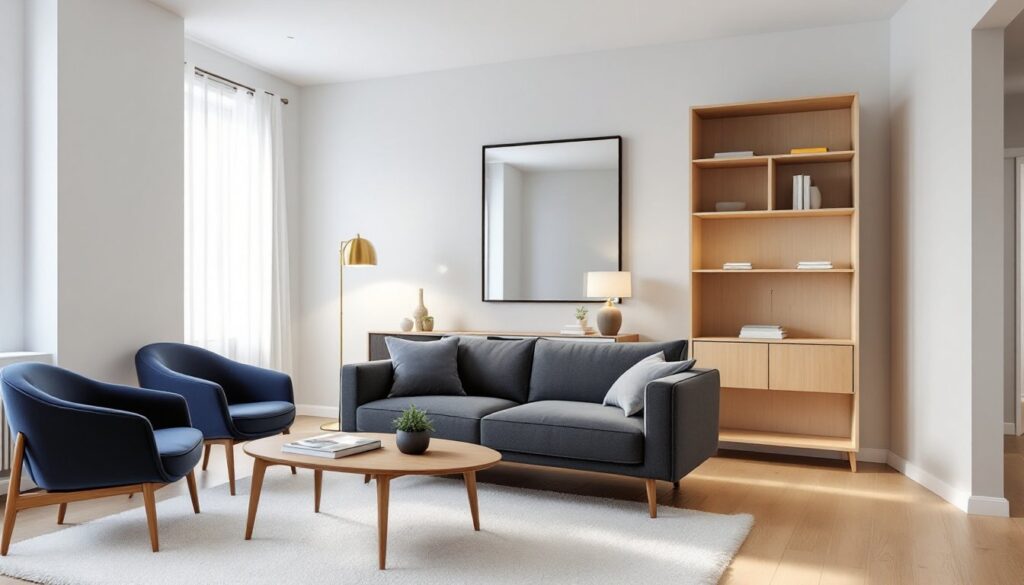
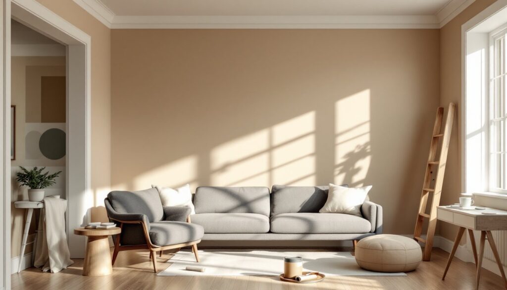
Warm Neutrals: Timeless and Versatile Choices
Warm neutrals dominate living rooms for good reason: they pair with nearly any furniture style, don’t compete with artwork, and age well as trends shift. These aren’t the builder-grade beiges of the early 2000s, modern warm neutrals have undertones that add depth without reading as overtly colorful.
Greige (gray-beige blends) remains the workhorse of living room palettes. Look for options with LRVs between 55–65 for balanced light reflection. Sherwin-Williams Accessible Beige (SW 7036, LRV 58) and Benjamin Moore Revere Pewter (HC-172, LRV 55.51) are go-to choices that shift slightly in tone depending on natural vs. artificial light. Both handle warm wood tones and cool metals without clashing.
Warm white works in spaces with strong architectural details or where the homeowner wants furnishings to take center stage. Benjamin Moore White Dove (OC-17, LRV 83.16) has a soft, creamy undertone that prevents the sterile feel of pure white. It’s particularly effective in rooms with abundant natural light or white trim.
Soft taupe and mushroom tones add earthiness without going dark. These colors work well in mid-century modern or Scandinavian-inspired spaces. Behr Sculptor Clay (N230-4) offers a muted, clay-like warmth that pairs with natural fibers and greenery.
One gallon of quality interior paint typically covers 350–400 square feet with one coat. Most living rooms need two coats for even coverage, especially when shifting from a darker existing color. Always prime when going from dark to light or when covering stains.
Cool Tones for a Calming Retreat
Cool-toned living rooms feel spacious and serene, making them ideal for homes in warm climates or for homeowners who want a retreat-like atmosphere. These colors work especially well in south-facing rooms where abundant sunlight prevents them from feeling cold.
Soft blues bring tranquility without feeling too bedroom-like. Benjamin Moore Palladian Blue (HC-144, LRV 59.58) is a muted blue-green that reads differently throughout the day, more blue in morning light, more green in afternoon sun. It’s a strong choice for coastal or transitional interiors. Sherwin-Williams Rainwashed (SW 6211, LRV 60) leans slightly grayer and works with both warm woods and industrial metals.
Sage and muted greens have surged in popularity as biophilic design (bringing nature indoors) gains traction. These aren’t the bright limes of the 1970s, they’re dusty, grounded greens with gray undertones. Behr In the Moment (S390-4) and Sherwin-Williams Clary Sage (SW 6178, LRV 51) both complement natural textures like jute, linen, and live-edge wood.
Cool grays can feel modern and crisp but require careful selection to avoid the dreaded “builder gray” flatness. Look for grays with slight blue or green undertones rather than purple-leaning options, which can clash with warm lighting. Sherwin-Williams Repose Gray (SW 7015, LRV 58) is a neutral cool gray that doesn’t skew too cold.
Test samples on at least two walls, one that receives direct light and one in shadow. Paint shifts dramatically based on surrounding light, and what looks perfect on a 2×2 swatch can read completely differently at scale.
Bold and Dramatic: Statement Colors That Wow
Statement walls or full-room bold colors make sense in larger living rooms or spaces where the homeowner wants a defined, confident aesthetic. These aren’t beginner moves, they require commitment and careful coordination with furnishings and lighting, but the payoff is a room with serious personality.
Deep navy and charcoal create sophisticated, enveloping spaces. Sherwin-Williams Naval (SW 6244, LRV 4) is a near-black navy that works surprisingly well in rooms with high ceilings and good natural light. It makes white trim pop and serves as a dramatic backdrop for brass fixtures and jewel-toned textiles. Farrow & Ball Railings (No. 31) offers a soft black with warm undertones that feel gentler than true black.
These dark colors absorb significant light, so plan for layered lighting: overhead, task, and ambient sources. A single ceiling fixture won’t cut it.
Terracotta and warm rust tones bring earthy drama without the moodiness of dark blues. Sherwin-Williams Cavern Clay (SW 7701, LRV 28) became a design darling for good reason, it’s warm, grounding, and pairs with both modern and bohemian styles. It works especially well as an accent wall behind a sofa or fireplace.
Emerald and forest greens offer richness and depth. Benjamin Moore Forest Green (2047-10, LRV 6) works in traditional spaces with dark wood furniture, while lighter options like Hidden Falls (SF495, LRV 22) bring the look down a notch in intensity.
Bold colors often require a high-quality primer and potentially three coats for full coverage, especially over lighter existing paint. Factor that into material costs and project timelines.
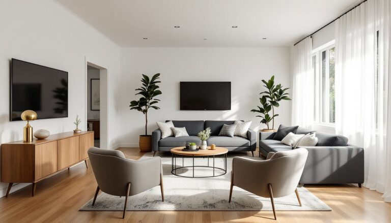
Best Colors for Small vs. Large Living Rooms
Room dimensions and ceiling height should directly influence color choice. The old rule, light colors make small rooms bigger, holds true, but it’s not the whole story.
Small Living Rooms
In compact spaces (under 200 square feet), high-LRV colors expand the room visually by reflecting light. Whites, pale grays, and soft blues with LRVs above 60 are safe bets. Benjamin Moore Simply White (OC-117, LRV 91.7) maximizes light reflection without feeling stark.
Avoid stark white-on-white if the room lacks architectural interest, it can feel flat. Instead, use slightly warmer whites or add contrast with darker trim (a reversal of the traditional light-walls-white-trim approach).
Monochromatic schemes (walls, trim, and ceiling in similar tones) blur boundaries and make walls recede. This works particularly well in open-plan spaces where the living room flows into a kitchen or dining area.
Large Living Rooms
Rooms over 300 square feet with 9-foot or higher ceilings can handle darker, more saturated colors without feeling cramped. In fact, lighter colors in oversized rooms can feel cold and uninviting.
Consider painting the ceiling a shade or two darker than the walls to lower the perceived height and create intimacy. Sherwin-Williams Alabaster (SW 7008, LRV 82) on walls with Accessible Beige on the ceiling brings visual warmth without going dark.
Large rooms also benefit from accent walls or two-tone approaches. Painting the wall behind the main seating area in a deeper tone anchors the space and defines the conversation zone.
How to Choose the Right Color for Your Living Room
Selecting a living room color involves more than browsing paint chips. Start by evaluating the room’s existing elements and functional needs.
Assess fixed elements first. Flooring, fireplace stone or brick, built-in shelving, and trim color all limit or guide the palette. If the room has honey oak floors, cool grays may clash, warm greiges or soft greens will harmonize better. Red brick fireplaces pair well with warm whites, soft greens, or even charcoal for contrast.
Consider the room’s light exposure. North-facing rooms receive cooler, indirect light and benefit from warm paint tones to counteract the blue cast. South-facing rooms get intense, warm light and can handle cooler colors. East-facing rooms are bright in the morning but dim in the afternoon, midtone neutrals balance the shift. West-facing rooms get strong afternoon sun: darker or cooler tones prevent them from feeling too hot.
Test samples at scale. Purchase sample sizes (usually 8 oz.) and paint at least 2×2-foot sections on multiple walls. Observe them over several days at different times. Paint looks different at 8 a.m. versus 8 p.m., and a color that feels perfect in afternoon sun may look dull under evening lamps.
Match sheen to function. Living rooms typically use eggshell or satin finishes. Eggshell (10–25% gloss) hides minor wall imperfections and is easy to clean, ideal for homes without kids or pets. Satin (25–35% gloss) is more durable and washable, better for high-traffic spaces. Flat or matte finishes show every scuff and aren’t practical unless the room is rarely used.
Factor in the color’s undertone. Almost every paint has a subtle secondary hue. Grays can lean blue, green, or purple. Whites can have pink, yellow, or gray undertones. Paint a sample next to existing furniture and observe it under both natural light and the room’s primary artificial lighting (LED bulbs vary widely in color temperature).
Conclusion
The best living room paint color balances personal style with the room’s physical realities, light, size, and existing finishes. Warm neutrals offer flexibility and longevity, cool tones create calm and openness, and bold hues deliver personality for those willing to commit. Sampling paint at scale, understanding LRV, and considering how light shifts throughout the day are the difference between a color that works and one that needs a redo in six months. Take the time upfront, and the result will feel right for years.