
A 16×18 living room offers 288 square feet of usable space, enough to feel comfortable without overwhelming most homeowners with furniture choices. It’s not a sprawling great room, but it’s not a cramped apartment either. The challenge lies in balancing function and flow without leaving dead zones or creating pinch points that trip up daily traffic. Getting the layout right means measuring twice, understanding the room’s actual proportions, and arranging furniture to serve real needs, not just copying a catalog photo. This guide walks through proven arrangements, zoning strategies, and the common mistakes that turn a decent-sized room into a frustrating space.
Table of Contents
ToggleKey Takeaways
- A 16×18 living room layout offers 288 square feet of usable space that benefits from careful planning to avoid dead zones and traffic bottlenecks.
- Choose between conversation-focused or TV-centered layouts based on your household priorities, rather than attempting a half-committed middle ground.
- Floating furniture 18–24 inches from walls improves room proportions and prevents the cramped “waiting room” effect.
- Define multiple zones using area rugs, furniture placement, and layered lighting rather than heavy barriers that shrink the perceived space.
- Oversized furniture and wall-pushed arrangements are common mistakes that waste floor space and create awkward traffic flow in this room size.
- Create a detailed floor plan using graph paper or room planner apps before purchasing furniture to prevent costly layout errors.
Understanding Your 16×18 Living Room Dimensions
Before dragging a sofa across the floor, measure the room’s actual dimensions. Builders and listing sheets sometimes round up, and that missing six inches matters when fitting a sectional. Use a 25-foot tape measure and note the distances from wall to wall, corner to corner.
A 16×18 room provides 288 square feet of floor area. That’s roughly the size of two standard parking spaces laid side by side, helpful to visualize, but furniture doesn’t park in neat rows. The proportions matter more than total area. This room is slightly rectangular, not square, which influences furniture placement. The 18-foot wall becomes the natural focal point in most layouts, whether for a fireplace, entertainment center, or window wall.
Account for architectural features that eat into usable space. Door swings, baseboard heaters, floor vents, and windows with low sills all create no-furniture zones. Sketch these on graph paper or use a free room planner app. Mark doorways with their swing direction, a door that opens into the room steals about 10 square feet of placement options.
Ceiling height also affects scale and furniture proportion. Standard 8-foot ceilings pair well with lower-profile seating and media consoles. If the room has 9- or 10-foot ceilings, taller bookcases, floor lamps, and vertical artwork prevent the space from feeling bottom-heavy.
Best Furniture Arrangements for a 16×18 Living Room
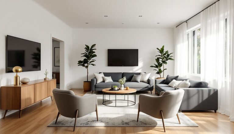
Two core layouts dominate this size room: conversation-focused and TV-centered. Each serves different priorities, and both can work, but picking one avoids the half-committed middle ground that satisfies nobody.
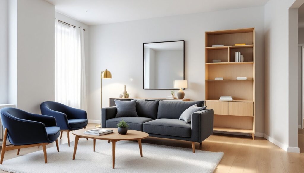
Conversation-Focused Layout
This arrangement works for households that entertain often or prefer face-to-face seating over screen time. Place a three-seat sofa (84–90 inches long) along the 18-foot wall, centered if possible. Position two accent chairs or a loveseat opposite the sofa, leaving a 3.5- to 4-foot gap between. This gap accommodates a coffee table (48–60 inches long) without forcing people to shimmy sideways.
Anchor the furniture grouping with an area rug (8×10 or 9×12 feet). The front legs of all seating should rest on the rug, this visually ties the arrangement together. Leave 18–24 inches between the sofa back and the wall for breathing room and to prevent a pushed-against-the-wall look.
Add a console table or bookcase behind the sofa if space allows. This creates a subtle boundary without blocking sightlines and provides surface area for lamps or storage. Side tables flanking the chairs complete the setup and give guests a place to set drinks without reaching.
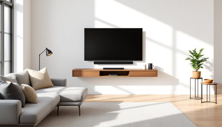
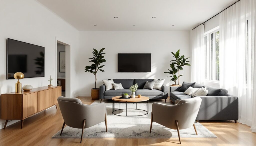
TV-Centered Layout
For media-focused households, the TV becomes the room’s anchor. Mount the screen or place a media console (60–72 inches wide) on the 16-foot wall. This shorter wall keeps viewing distance comfortable, ideally 1.5 to 2.5 times the TV’s diagonal screen size. For a 55-inch TV, that’s roughly 7 to 11 feet, well within the room’s dimensions.
Position the sofa directly opposite, 8–10 feet from the screen. If the household wants more seating, flank the sofa with two chairs angled slightly inward, creating a shallow U-shape. Avoid placing chairs perpendicular to the TV unless they swivel, nobody wants a 90-degree neck angle during a movie.
Keep the coffee table low-profile, around 16–18 inches high, so it doesn’t block the bottom of the screen. Skip chunky ottomans with storage unless the TV is wall-mounted above typical sightlines.
If there’s a fireplace on the same wall as the TV, mount the TV above the mantel only if the mantel height keeps the screen’s center at or near eye level when seated (roughly 42 inches from the floor). Mounting too high leads to neck strain. If the fireplace is on a different wall, choose one focal point, splitting attention between two features rarely works in a room this size.
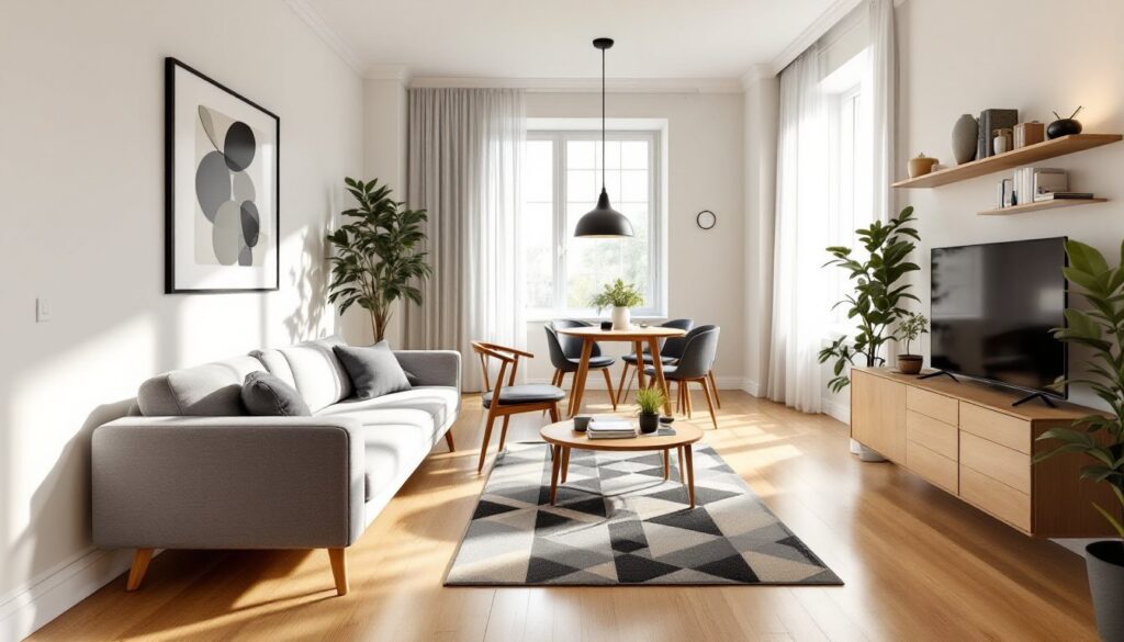
Zoning Strategies to Define Different Areas
A 16×18 room can handle light zoning, dividing the space into two functions without walls or permanent barriers. Common pairings include a seating area plus a reading nook, workspace, or dining extension.
Use furniture placement as the primary divider. A sofa floating 3–4 feet from the wall naturally creates a front zone and a back zone. The area behind the sofa becomes a secondary space. A narrow console table (10–12 inches deep) behind the sofa reinforces the division while adding function. Top it with task lighting and a small chair to create a workspace or hobby area.
Area rugs define zones without physical barriers. In a dual-purpose layout, place one rug under the main seating group and a smaller rug (5×7 or 6×9 feet) in the secondary zone. Different rug textures or colors visually separate the areas, but keep them coordinated to avoid a chaotic look.
Bookcases or open shelving units work as partial dividers. A 5-foot-tall bookcase placed perpendicular to a wall blocks sightlines at seated height but doesn’t close off the room. Choose open-back designs to maintain airflow and light.
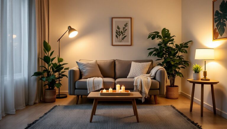
Lighting reinforces zones effectively. Overhead lighting handles general illumination, but floor lamps, table lamps, and swing-arm wall sconces create task-specific pools of light. A reading chair paired with a dedicated lamp feels distinct from the main seating area even without a physical divider.
Skip heavy curtains or folding screens in a room this size, they chop up the space and make it feel smaller. Zoning should suggest separation, not build walls.
Traffic Flow and Furniture Placement Tips
Good traffic flow means moving through the room without sideswiping furniture or doing the awkward shuffle. Walkways need 30–36 inches of clearance, 30 is passable, 36 is comfortable, and anything less creates bottlenecks.
Identify the room’s primary entry and exit points. Most living rooms have at least two: a main doorway and a passage to another room or hallway. Draw imaginary lines between these points, that’s the natural traffic path. Furniture should frame these paths, not intersect them.
Avoid placing the sofa or chairs where the back faces the main entry. People walking into the room shouldn’t stare at the back of someone’s head. If the layout forces this, use a console table behind the sofa to soften the view and add visual interest.
Leave 14–18 inches between a coffee table and the sofa front. Less than that makes it hard to sit down or stand up without banging shins. More than 18 inches forces an awkward reach for drinks or remotes.
Float furniture when possible rather than shoving it against walls. A sofa pulled 18–24 inches off the wall opens up space for a sofa table and prevents the “waiting room” vibe of perimeter seating. It also improves room proportions visually.
Consider doorway width and furniture delivery paths during planning. A sectional that barely fits through a 32-inch doorway will fit, but the delivery crew won’t appreciate it. Measure tight corners, hallways, and door frames before ordering large pieces. Some sectionals ship in pieces: others don’t.
If the room has multiple functions (TV watching, conversation, reading), arrange furniture so someone can move between zones without crossing directly in front of a seated person or the TV screen.
Common Layout Mistakes to Avoid
Oversized furniture is the most frequent mistake. A 10-foot sectional might look great in the showroom, but it dominates a 16×18 room and leaves little space for anything else. Measure furniture dimensions, not just length, but depth and height. A sofa that’s 40 inches deep eats significantly more floor space than a 36-inch model.
Pushing all furniture against the walls creates a bowling alley effect with a dead zone in the center. It also makes conversation awkward, nobody wants to shout across 12 feet of empty floor. Floating at least some pieces improves flow and coziness.
Ignoring scale leads to mismatched furniture that fights for attention. A massive coffee table paired with delicate side chairs looks unbalanced. Aim for visual weight that’s distributed evenly. If the sofa is substantial, balance it with a sturdy coffee table and solid chairs, not spindly wireframe pieces.
Blocking windows or vents with furniture reduces natural light and airflow. Leave at least 6 inches between a sofa back and a baseboard heater. Don’t park a bookcase in front of a return air vent, it restricts HVAC efficiency and can trip safety switches.
Too many small pieces clutter the room and make it feel chaotic. Three small side tables, four accent chairs, and two ottomans might technically fit, but the visual noise overwhelms the space. Fewer, larger pieces create calm and function better.
Skipping a floor plan before buying furniture is a gamble. Graph paper, painter’s tape on the floor, or a digital room planner prevents expensive mistakes. Tape out furniture footprints at actual size and live with the layout for a day or two. Walk through it, sit in the taped zones, and adjust before committing to purchases.
Ignoring lighting layers leaves the room flat. Relying on a single overhead fixture creates harsh shadows and no ambiance. Combine ambient (overhead), task (reading lamps), and accent (picture lights, sconces) lighting for flexibility and mood.